using data, design, and engineering to solve problems and tell stories that matter
data visuals editor at the council on
foreign relations
previously, a research engineer at the mansueto institute for urban innovation helping academics and journalists understand public transportation, property ownership networks, public finance, property taxes, etc. before that, the data editor at the chicago maroon, analytics at the dnc, and youth programming at changeist
find me on linkedin, github, or reach out via email at asteinhart3 at gmail dot com
follow my work via rss or email subscription

An unprecedented emigration wave has emptied Cuba of up to a quarter of its population since 2020. The demographic fallout will reverberate for decades to come, affecting any future recovery or political transition.
An interactive map of the New York Times' Metropolitan Diary placed where they happened, 1976–2026.
Food has increasingly become a tool of war, triggering humanitarian devastation and disrupting global food supplies. International authorities appear incapable of responding.

A guide to creating scrollytelling stories including when the format is worth using, and the different techniques for pulling it off.
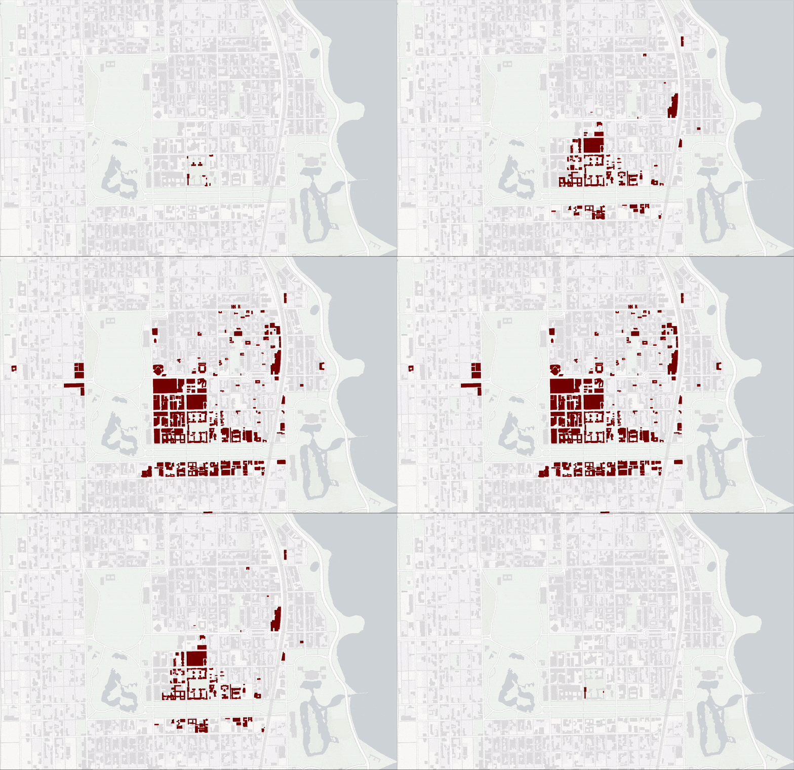
Drawing from University archives, campus maps, academic literature, and news clippings, the Maroon charted the University's contentious property acquisitions from its charter in 1890 to the present. Featured on the front page of Hacker News and r/Chicago.